Imagine seeing a steady stream of people walking into a coffee shop, and at the exact same time, noticing a surge in traffic on the nearby highway. Do the coffee drinkers cause the traffic jam? Probably not. Yet, the observed pattern--the connection between two seemingly unrelated events--is exactly what psychologists look for when studying correlations. Understanding this intricate dance between variables is fundamental to unlocking the mysteries of human behavior, but it comes with a crucial caveat: just because two things happen together doesn't mean one is making the other happen.
What Exactly is a Correlation?
At its heart, a correlation is simply a statistical measure that describes the extent to which two or more variables fluctuate together. Think of it as observing a relationship: when one thing changes, does another thing tend to change too? This doesn't imply that one variable is the direct cause of the other's change; rather, it highlights a pattern of association. In psychology, understanding the role of correlations in research is vital because many human experiences and behaviors can't be ethically or practically manipulated in a laboratory setting. Instead, researchers gather data and look for these observable relationships to make inferences and predictions.
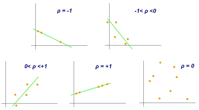
The strength and direction of this relationship are quantified by something called a correlation coefficient, typically represented by the letter 'r'. This number hovers between -1 and +1. An 'r' value close to +1 indicates a strong positive relationship, meaning as one variable increases, the other tends to increase as well. Conversely, an 'r' value near -1 suggests a strong negative relationship, where one variable's increase is associated with the other's decrease.
Decoding the Correlation Coefficient
The correlation coefficient (r) is your go-to tool for understanding how closely two variables are linked in a linear fashion. Remember, the closer 'r' is to either +1 or -1, the stronger that linear connection is. If 'r' is close to 0, the variables have a weak or non-existent linear relationship.
This is particularly useful in psychology because, unlike controlled lab experiments, real-world research often involves observing phenomena as they naturally occur. For instance, researchers might study the relationship between hours of sleep and reported levels of anxiety. They aren't making people lose sleep (that would be unethical); they're collecting data on how much people *actually* sleep and how anxious they *feel*, then looking for a pattern.
Positive, Negative, and Zero Relationships
Let's break down what those 'r' values actually mean:
- Positive Correlation (r close to +1): Imagine tracking study hours and exam scores. Generally, the more hours a student studies, the higher their exam score tends to be. Both variables move in the same direction. A perfect positive correlation (+1) would mean that for every increase in one variable, there's a perfectly predictable increase in the other.
- Negative Correlation (r close to -1): Consider the relationship between the number of hours spent practicing a musical instrument and the number of mistakes made during a performance. As practice time increases, the number of mistakes typically decreases. These variables move in opposite directions. A perfect negative correlation (-1) means one variable's increase is perfectly matched by the other's decrease.
- Zero Correlation (r=0): This suggests no discernible linear relationship between the two variables. For example, there's likely a zero correlation between the number of pets someone owns and their favorite color. One doesn't predict the other in any meaningful linear way.
It's crucial to grasp that a correlation of -0.9 is much stronger than a correlation of +0.2. The negative sign simply indicates the direction (opposite movement), not the strength of the relationship. The number itself--how close it is to 1--determines the strength.
Visualizing Connections with Scatter Plots
To get a visual sense of these relationships, psychologists often turn to scatter plots. These graphs display individual data points, with each point representing a pair of measurements for two variables. One variable is plotted on the horizontal axis (x-axis), and the other on the vertical axis (y-axis).
By looking at the pattern of dots, you can often see a trend. If the dots cluster around an upward-sloping line, it suggests a positive correlation. If they cluster around a downward-sloping line, it indicates a negative correlation. When the dots are scattered randomly with no clear pattern, it points to a weak or zero correlation. The correlation coefficient ('r') essentially quantifies the slope and tightness of this perceived trend line.
For example, plotting 'daily screen time' against 'reported sleep quality' might reveal a cloud of points. If the points trend downwards from left to right, it visually confirms that more screen time is associated with poorer sleep quality. The role of correlations in understanding these visual trends is profound for initial hypothesis generation.
The Critical Distinction: Correlation vs. Causation
This is perhaps the most important takeaway when discussing correlations: correlation does not equal causation. Just because two variables are linked doesn't mean one is directly causing the other to change. This is a common pitfall in interpreting research and everyday observations.
Consider the well-known example of ice cream sales and crime rates. Both tend to rise during the summer months. Does eating ice cream cause people to commit crimes? Absolutely not. The underlying factor, or third variable, is the heat. Warmer weather leads more people to buy ice cream and leads to more people being outdoors, increasing opportunities for crime. The relationship is correlated, but not causal.
Another example: you might observe that people who regularly attend yoga classes report lower stress levels. This shows a positive correlation. However, it's impossible to definitively say from this observation alone that yoga *causes* stress reduction. Perhaps people who are already less stressed are more inclined to try yoga. Or maybe both factors are influenced by a third variable, like having more leisure time. The role of correlations in highlighting potential links is clear, but proving causation requires more rigorous experimental design.
Beware the Illusory Correlation
Sometimes, we perceive a relationship between two variables that simply doesn't exist, or is far weaker than we believe. This is known as an illusory correlation. It's a cognitive shortcut where our minds see patterns, even when they aren't really there, often based on stereotypes or isolated incidents.
For instance, someone might believe that people who drive red cars are more aggressive drivers. They might vividly remember seeing a few instances of aggressive driving by people in red cars, while ignoring the countless times they saw aggressive drivers in other colored cars, or non-aggressive drivers in red cars. This selective attention strengthens the illusory belief. This type of thinking can perpetuate harmful stereotypes, as we might wrongly associate certain traits with specific groups based on coincidental occurrences rather than actual data.
Understanding the role of correlations in psychological research means appreciating both the power of identifying relationships and the absolute necessity of not jumping to conclusions about cause and effect. While correlation can point researchers in promising directions, only carefully controlled experiments can establish causality. So, the next time you notice two things happening together, remember the coffee shop and the traffic jam - a connection doesn't always mean a cause.